
Internorga Ice Cream Forum
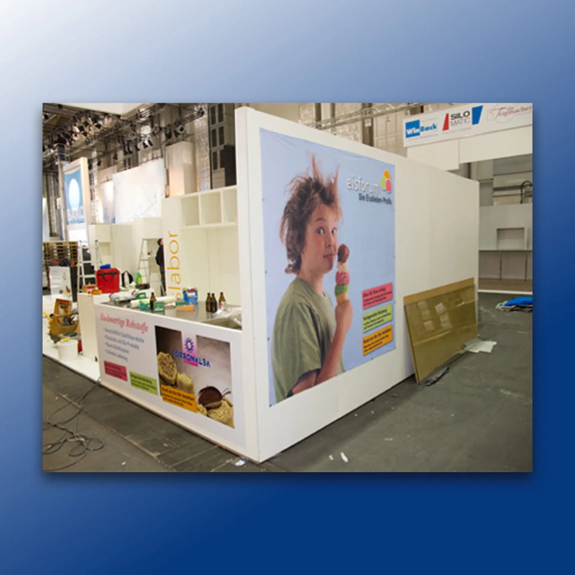
As part of the overall support, I developed a whole range of graphic elements that transformed the existing exhibition stand into a meaningful medium for the latest messages and the most important exhibition highlights. Client: Eisforum GmbH & Co.KG, Iserlohn Year: 2013 Back
Catalogues for ice cream parlour supplies
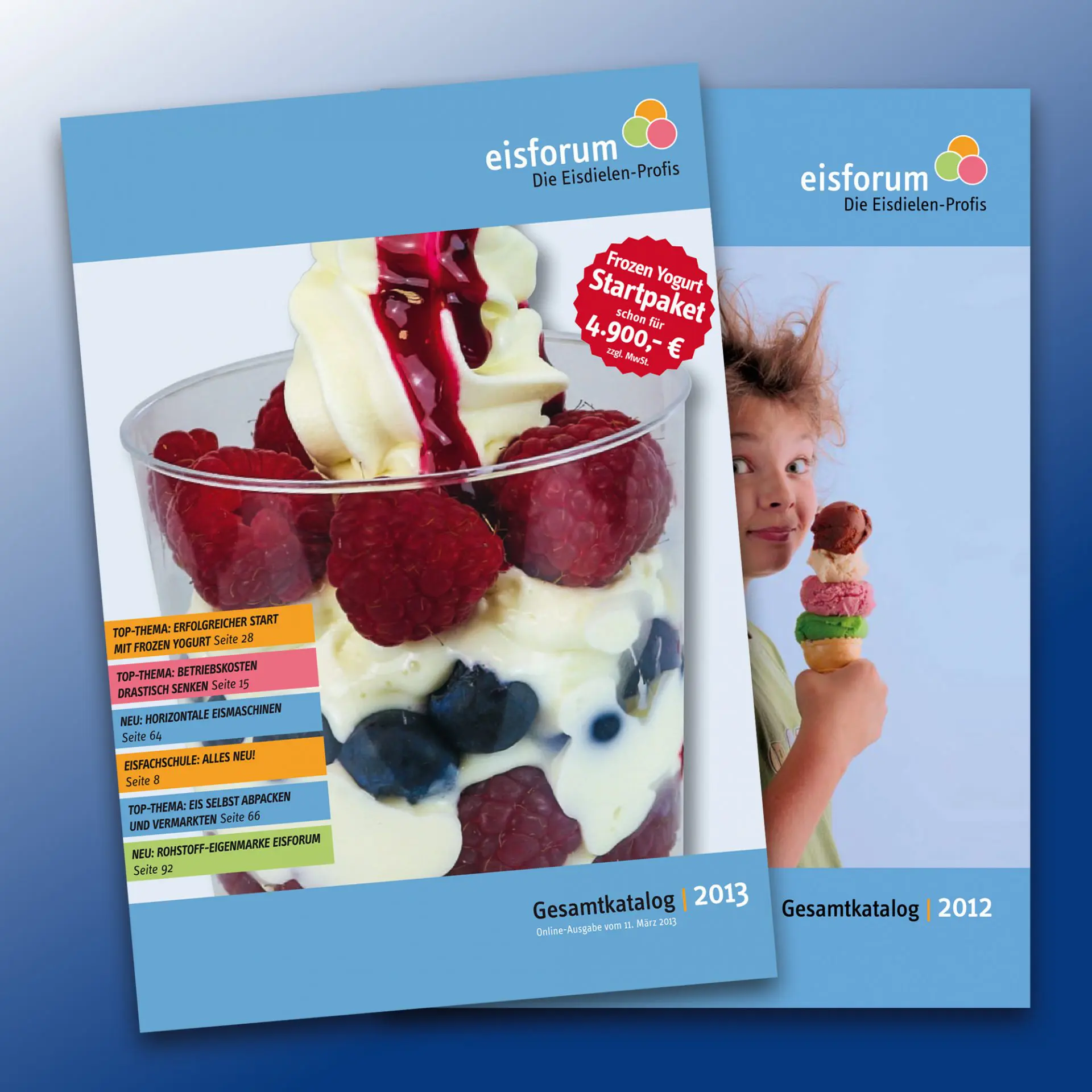
Alongside the webshop, the catalogue is naturally the most important sales tool for Eisforum GmbH & Co. KG, a mail-order company for everything an ice cream parlour needs. In 2012, I was able to make the catalogue much more user-friendly with a new page layout and in 2013, I added a whole range of new features that enabled significantly more efficient use of the […]
Subvenio Fundraising
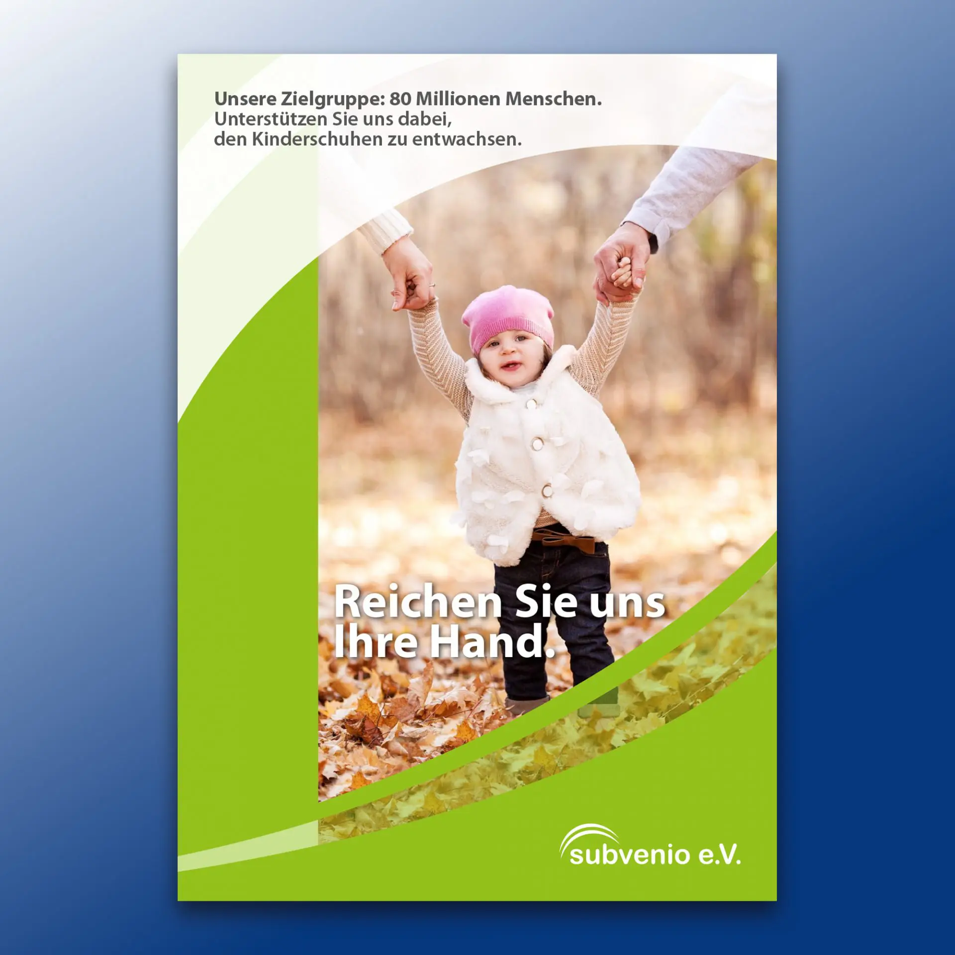
At the end of 2012, Subvenio e.V. – a non-profit organisation that supports accident victims – approached me with a request to produce a brochure to acquire companies and institutions as donors. In addition to the concept, copywriting, design and prepress work, I also took care of the photography at their Düsseldorf offices. Client: Subvenio e.V., DüsseldorfYear: 2012 PDF download: Fundraising brochure Back
Pioneer Car Entertainment
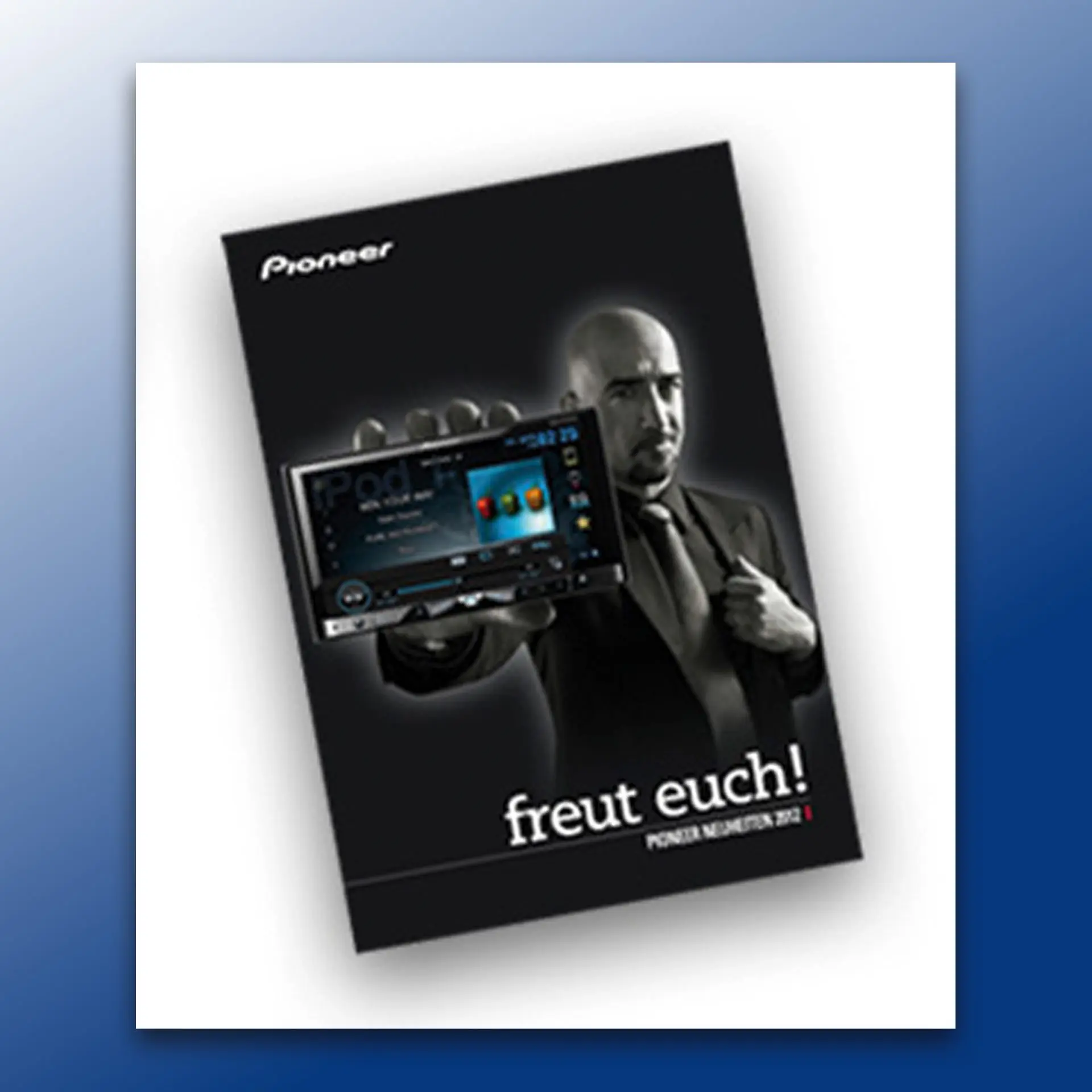
In addition to the annually published „Car Entertainment Guide“, the all-European car audio catalogue, Pioneer Electronics (Deutschland) GmbH in Willich continually requires special publications for the German market, which I am always happy to supply. Besides brochures and leaflets, I also develop advert templates and POS campaigns, which I also implement in the client's CMS system – so […]
Eickhoff Corporate Design
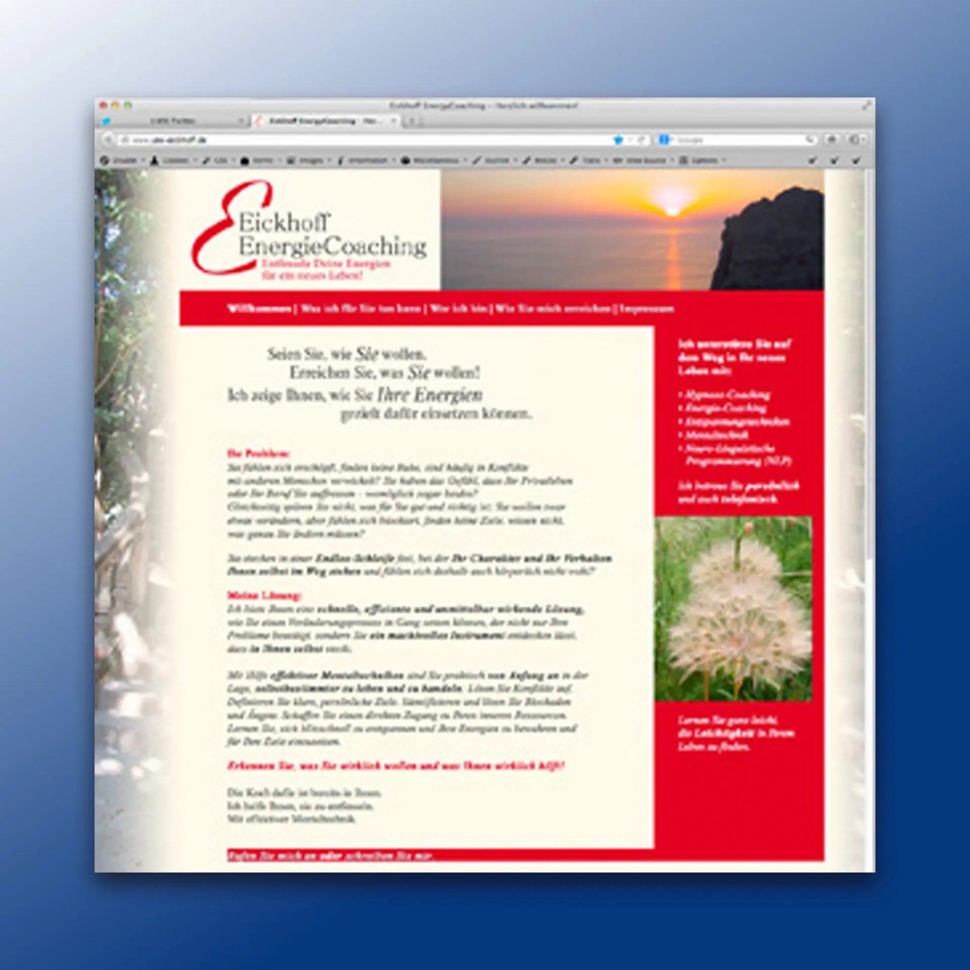
As part of an individual starter package, the website was included alongside the development of the logo, name, and business stationery – a key component of the customer acquisition concept. Note: At the time, I was still relatively open-minded about esoteric topics, which I now consider a mistake. At the latest since the Corona pandemic, it has been confirmed to me that it makes sense to [...]
amtra packs
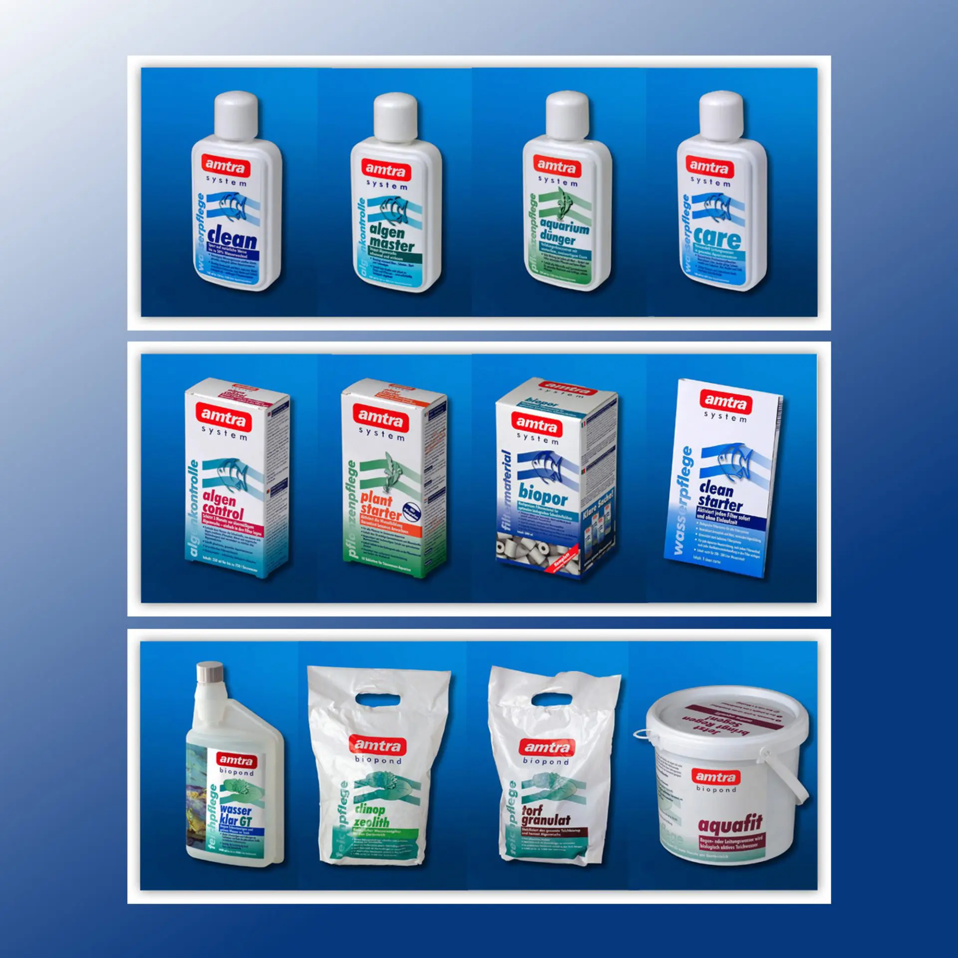
Alongside the careful modernisation of the brand logo, the profound redesign of the packaging formed the starting point for the development of the new CI in 2001. The most important characteristic of the new CI, besides a colour code for the visual structuring of the extensive range on offer in retail, is the extreme flexibility of the design, which allows for clean adaptation even in the most impossible formats. […]
amtra POS displays
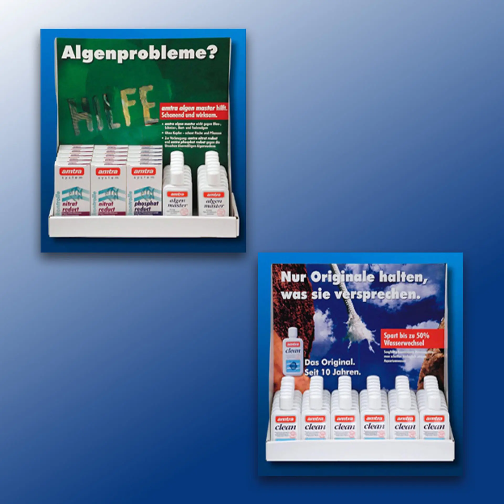
For maximum recognition at the POS, sales displays with motifs from the print advertising ensured this. Client: amtra GmbH, Rodgau Year: 2001-2005 Back
amtra trade adverts
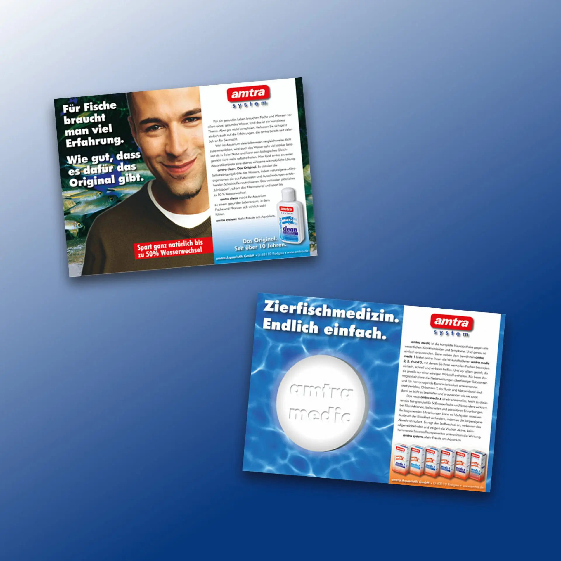
The print advertisements in relevant trade magazines each conveyed their complex content through a simple, clear, and striking idea. The design originally developed for the packaging was also applied to a high degree in the print advertising in order to achieve maximum brand recognition. Client: amtra GmbH, RodgauYear: 2001-2005 Back
SAGA image brochure
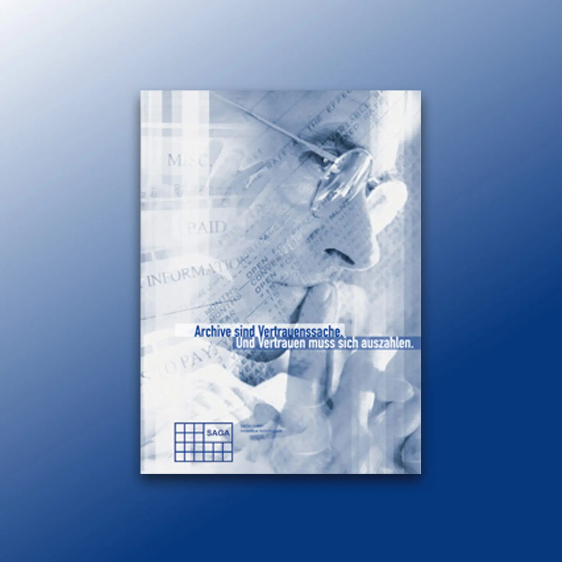
A typical example of a company presentation à la rdh|kommunikation: Benefit-oriented, informative and sales-promoting, the website was also designed – with a well-arranged and clear tab system as the main navigation, which almost naturally arose from the topic – it's about the secure archiving of large volumes of data. Client: Saga GmbH, Düsseldorf Year: 2004 PDF Downloads: Image Brochure Back
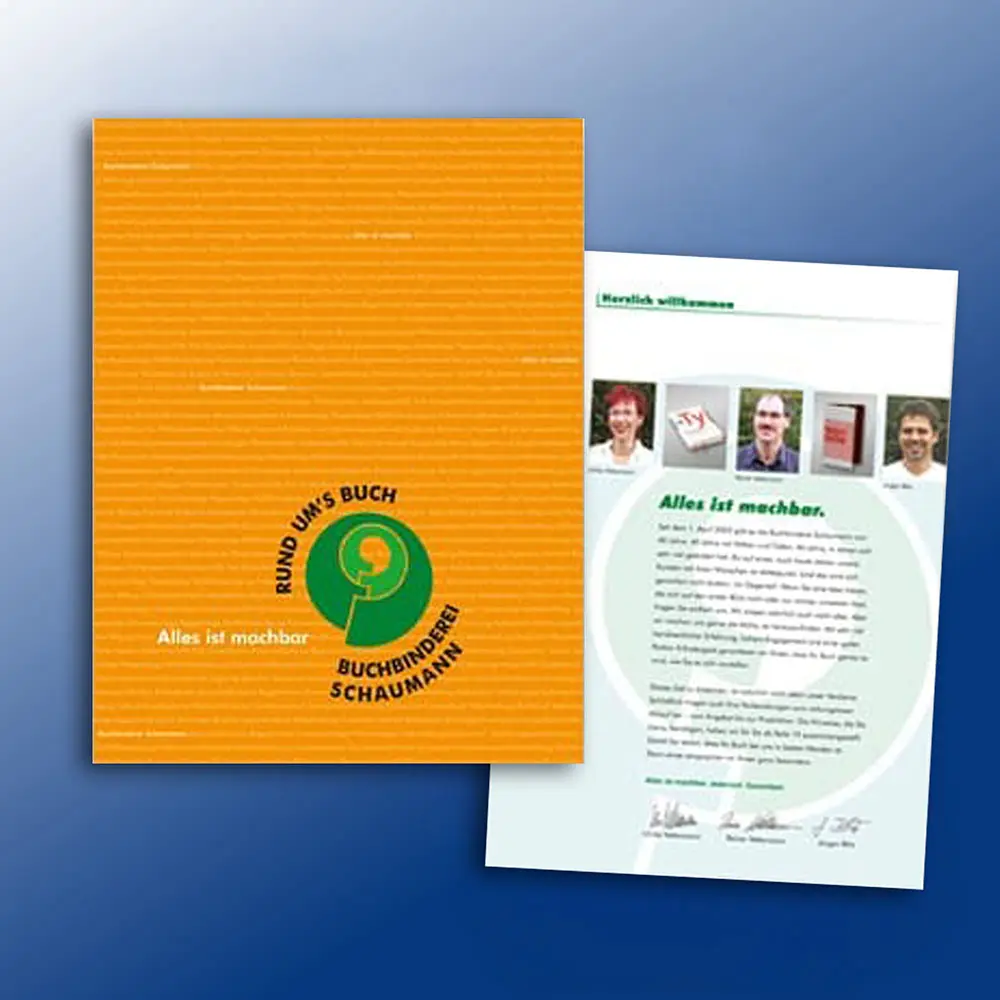
Schaumann image book
For the fortieth anniversary of Buchbinderei Schaumann in Darmstadt, the annual company brochure became what it had always intended to be: a proper book of about 100 pages. In addition to the text, design, and print preparation, I also took on the photography of the most interesting newly produced books and the current machinery „in action“. Client: Buchbinderei Schaumann, Darmstadt […]